It automatically speaks to the viewers in a very playful way. This is candy, something associated with childhood where everything seems brighter and more vibrant. It provides images to direct you where to go, you can customize your own which makes it interactive, it clearly states the companys mission, and it provides clear means by way of contacting them.
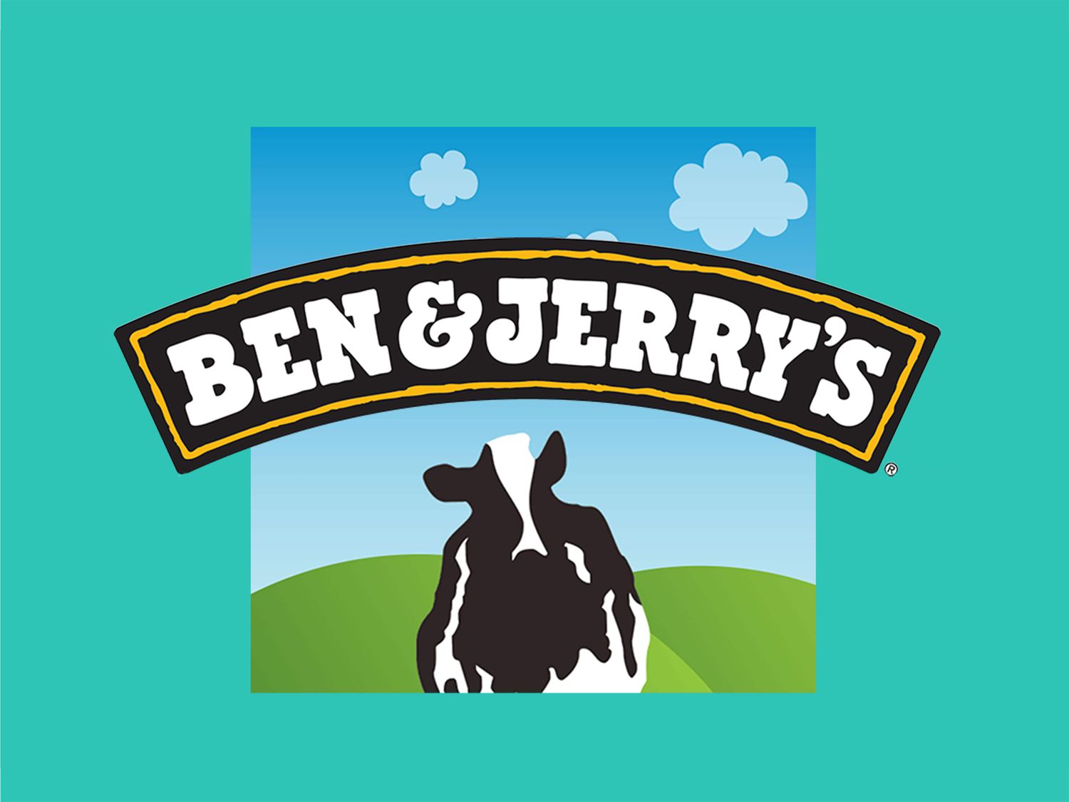
It has a very distinct color palette gravitating towards blue, green, and brown. There is also a font that goes as representation for the company/the font is associated with the company. The font size is relatively large and easy to read and navigate the website. It provides fresh and clear images so you understand what exactly the company is selling. In addition, there is a section where they touch on real life issues and are spreading awareness about getting involved in social and environmental issues showing that while their main focus is ice cream, they do care about the communities and surrounding issues.
The clothing is very much sports based, leading towards casual and comfortable wear. I find that the website does wonderful in organizing the platform to look like a sports magazine. The photos continuously shift which catches your attention therefore sparks an interest in what other items this website may have. The font is very slim and tall yet still legible and easy to navigate. While it may seem hectic, there is almost a simplistic composition about it.
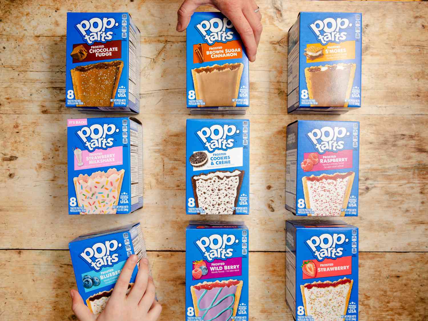
The packaging itself is blue so naturally the color of the website is blue, mixed with the purple makes me think of something sweet or exciting. The font is very playful and bold and provides a section at the bottom where you can explore the site more, find recipes, see what new flavors are, etc. As you go into the our story page, there's an image of a bunch of poptarts crafted into the shape of the United States- which is a really cool graphic showing is expansion/influence over the entire company. It then dives deeper into the history of its growth, its relations to other companies/brands, and its change in flavors based on consumption.
The website has a contrasting black and white coloring, with visuals from the models in the pictures, its a very gothic style clothing website. You instantly hear heavy metal music and the platform is really organized and symmetrical in its placement of information/ subsections. It provides a variety of images showing their items as well as 'hot' topics such as the new season of Wednesday or new netflix shows, etc. There is also a halloween theme which can be very fun to browse.